Saturday, September 24, 2011

CD cover design

We had to do a CD cover design last year for our graphic design module. I picked the song "Hello, I love you" by Cory Monteith from Glee. This is the song!

I thought the song sounded a little disco and retro-ish. I don't really know what's the exact genre though!

This is the front cover. "Hello, I love you" is something you would say, so I placed the song title in a speech bubble that is formed by colourful circles. I used colourful circles since I thought the song sounded retro-ish. I also used a heart shape to replace 'o' in 'love' because I thought it'd look for interesting and cute! The song also had lots of repetitions of the song title "Hello, I love you", so I surrounded the speech bubble with repetitions of Hello, I love you in varying font sizes and in grey as it is the background.

For the back cover design, I made use of the same colourful circles and placed them cutting across the design and left the other side empty, only with the singer's name. It sort of creates a balance and I did not want to fill up the whole back cover design as it'd be too messy and cluttered. For the other side, I filled it up with the lyrics of the song in white/grey and varying font sizes as well, because it suits the feeling and rhythm of the song.

I also chose this particular font for the words because I felt that it looked slightly "old" and fit the song! I like how my design turned out to be, simple yet it is made up of many elements like colours, balance, proportion and emphasis.

Tree of Peace

Tree of Peace

A4, coloured marker pens

(26th July 2010)

We had to do a design for a competition and the theme was Peace. The colourful peace signs are like the tree leaves, growing out of the Tree of Peace! This shows the growth of peace. I kept the tree trunk and branches black so as to make the "peace leaves" stand out. The branches are filled with the word PEACE. I like how it is simple and I mainly used the peace sign as an element in the work, to express the idea of peace growing.

Invisible Relationships

Group Photo Series - Qiu Zhi Jie, Five Revolutionary Seconds - Sam Taylor-Wood


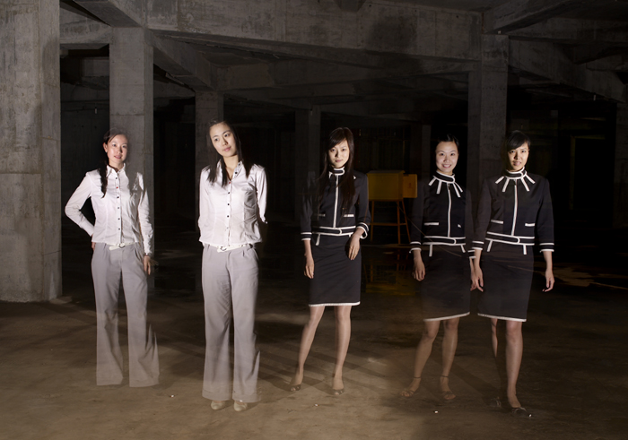
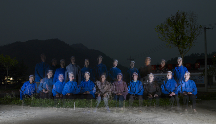
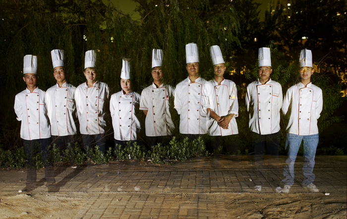
When I first saw Qiu's group photo series at the gallery, I wondered, "How did he take photographs like that? What was the meaning of the photographs? Why did he take those photographs? What was he trying to tell people?" The group photo series consists of 13 photographs in total. The photographs had dark backgrounds while the people seen in the photos were hit with light. The people looked like "ghostly figures", slightly translucent. The work was produced between 2006 and 2007 in different parts of China.

In Qiu's group photo series, it is also like a drama. In the video installation, it can be seen that, firstly, in the dark, a man walks to the front of the camera lens; stand up, the light lights on his body. He walks away. Then, the second person walks to the front of the camera lens too, standing beside the man who had just left. The light lights on his body. He walks away. One by one, the people walk onto the stage, stay for a while, and walk back. In the video, it shows a lonely person, appearing on the stage. Sometimes the man who is supposed to leave the stage may forget to leave. And sometimes, the man who is supposed to go onto the stage may not have arrived. Well the reason is, these people have received light and their form is kept, which becomes a group photo. Then, the group photo becomes a 'drama'. In the eyes of the audience, things that had happened in the same scene but in the different time are reconstructed in the same time and same space. Everyone in the photograph is related to each other. In the photo, the people appear together in the same group photo. Whereas in the video, they are actually very lonely themselves.

On the wall text next to Qiu's group photo series at the gallery, it was written that events happen at different times, but when seeing the photograph, they are relocated to the same time-space. The static photograph becomes a set of play an the relationship between one and the other is thus developed. Individuals appear as a group in the photographs ('we'), while the video shows them as solitary ('I'). In the photographs, there are collective narratives, names and identities of the individuals, but the video separates these identification.

In the video, the people are on of the "I-s", an individual. In the photograph, they are interpreted as "we", a group of people. They are a collective of narrative, a collective name and identity in the photography. However, the identity has been peeled off by the video. In the video, people return to the place which has no relation to others, people "escape" from the collective position. They are always neglecting the "I" but being aware of the "we". And when they think of "I", they often forget that "I" actually belongs to "we", a group of people. People are used to ignoring "I" when they consider the "we" and when they think about the "I" they forget that individuals unconsciously belong to a group.

The group photo series highlights the invisible relationship between people and it tells me that it takes up "I-s" to make up a "we".


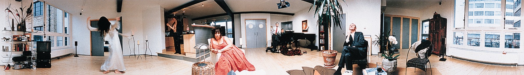
Five Revolutionary Seconds XI (1997)
Chromogenic color print (28 x 298" overall)

Next, let me move on to another contemporary artist's work, Five Revolutionary Seconds by Sam Taylor-Wood. The reason why the art work is named as Five Revolutionary Seconds, is because it combines elements of the still and moving image and it is taken by a rotating camera that turns nearly 360 degrees in five seconds. The work records the motions and gestures of six actors and friends enlisted by Sam Taylor-Wood.

In the photograph, each character seems to be lost in his or her own reality. They look bored. Everyone in the photograph seems to be in their own world, thinking about their own problems in life. It can be told from their facial expressions and their body language. They are only thinking about themselves alone, and ignoring the people around them. They are all withdrawn, thus unaware of the people around them, the things happening near to them and their surroundings. They are acting as individuals in the photograph. In my opinion, I feel that they are selfish people who only care for themselves and not realizing that others are also in the same state as they are.

From Qiu's group photo series, it shows that certain people has neglected the importance of "I-s" and themselves. They have forgotten the fact that the individuals are very important to a group as they belong to it.

On the other hand, from Sam Taylor-Wood's photographs, it tells me how the other group of people who are selfish. They only have thoughts for themselves and their problems. They live in the world of their own and only think about their own problems in life. They have not realized that everyone around them, near to them, is exactly like themselves. They only bother about themselves without understand others around them.

I feel that both of the contemporary artists' photographs show the different types of "invisible relationship" between people, however, in a different and unique manner.

Photo credits:
http://www.moma.org/interactives/exhibitions/1998/newphoto14/sam_taylor_wood.html

Happy World - Ik-Joong Kang (2008)

Mixed media on wood, 485 x 485cm

Detail from Happy World by Ik-Joon Kang

Happy World: 48 x 48 pieces of 3" x 3" glazed wooden tiles with either paint on them or objects stuck to it. The objects included toys like "beyblades", rubber ducks, yo-yos, guns and trucks. There were also pieces of mirrors, calculators, baseballs, can openers, spoons and even an old Canon camera. I liked the Canon camera, particularly. It was the only camera stuck onto the wooden tiles.

The artwork was named "Happy World". I thought that every day objects stuck onto the tiles looked interesting and fun. Toys, utensils, things that we would use everyday. Happy World shows everyday and simple objects. Most of them were toys that we or the previous generation tend to play when we were young. Hence, these objects give the artwork a happy feeling, making us remebmber the happy times during our childhood.

The artwork is filled with colours, yet, they are not clashing. Therefore, it does not spoil the artwork. Also, this artwork probably wants to tell us that simplicity can also bring happiness to one, and that we should be contented but not be greedy instead.

I really liked how Kang placed all the colourful objects together, without letting the colours clash and making the artwork look messy. I was awed as I knew it would take much patience and effort to stick every object onto the tiles or paint them. I was amazed by the number of tiles stuck on the wall, forming a huge piece of artwork on the wall, made by small ones.

I like this work as I think it brings happy memories to everyone who sees it, including myself.

Photo credits:

Thursday, September 22, 2011

Pay $250 for a photo with nude artist?

One of the first few things that came to my mind was: Is this art? What is art? Am I willing to pay $250 for a photo with the nude artist?

Well, I would say that art is subjective. I feel that everyone has a different perspective and view of what is/makes art. A person might think that this is art while another might not. Personally, I feel that as long as the artist claim that it is his art, I will accept that. However, I feel that I can decide whether I like the piece of art or not, and whether I think it is a piece of good art.

Also, there must be a meaning/idea that the artist would want to convey to the audience through his/her art. Venkenna posed naked to take photographs to represent the idea of “removing the trappings of identity”. However, I do not quite understand why he had to place Frida Kahlo's The Two Fridas behind him to take the photographs. I can see the similarity whereby The Two Fridas shows 2 Frida Kahlos' holding their hands, and Venkenna takes the photo with a visitor, holding his/her hand as well. The double self-portrait of Frida Kahlo was painted during her divorce from Diego Rivera (husband). The right Frida wears a traditional Mexican costume, representing the woman that Diego loved. In her hand, she holds a picture of him when he was a child. Her heart exposed is whole and complete. Whereas on the left, Frida wears a colonial-style wedding dress, with a broken heart and blood vessel dripping blood onto her lap. It represents an unloved Frida. Frida Kahlo said that this painting showed the 'duality of her personality'. She showed herself as a divided self, and that she is neither fully European nor fully Mexican Indian. Was Venkenna trying to combine his idea with Frida Kahlo's painting? Perhaps he was trying to imitate the scene in the painting to convey his idea of trapped identity. I guess every artists' works can be interpreted differently with different perspectives.

It made me wonder if what he did was necessary to convey his idea. As a student, I really think paying $250 to take a photo with him is not worth it. Honestly, I do not quite understand what is the purpose of taking a photograph with him, naked!

I do realise that in Singapore, what he did might not be acceptable for many Singaporeans. Many Singaporeans might not understand or appreciate what he was doing. Maybe he should not have displayed or carried out his performance in Singapore? I feel that as an artist, where you display your artwork matters a lot. Like what we have learnt in SOVA before, do artists have a social responsibility to uphold? I think if artworks are too personal and might bring much disagreements between people in society, they should be exhibited at a personal gallery. As for Venkenna, I can understand that he might be trying to spread and convey his idea of trapped identity to everyone. But his way of doing so was hard for many Singaporeans to understand and accept. He could have picked somewhere in Europe where nudity in the form of art is more acceptable!

Lastly, I do feel that it was not right of Art Stage Singapore to ask him to stop his work and remove his works. If the Media Development Authority (MDA) had given the permission for him to display and carry out his artwork, they should not ask him to remove it during the exhibition even if many people requested to do so because it is quite disrespectful towards Venkanna and his artwork. Also, additional measures were taken to screen the exhibit from the public area to avoid visitors from stumbling upon it by accident. Therefore, visitors of the art exhibition do have a choice of whether they want to his work or not. They can simply leave that area if they are not comfortable with it.

Monday, September 19, 2011

Singapore Biennale 2008

Who is Family - Rachel Goh (2008)

Installation

Video & Photography


When I first set my eyes on the family portrait of the artist's family, I got fascinated.

Singapore Biennale 2008

A family of five, looking happy, smiling brightly into the camera. They all looked close to one another and the daughter had her arms placed over her father and mother. They looked happy to be with one another, taking a photograph. As I continued looking through the other family portraits, I giggled.

Singapore Biennale 2008Singapore Biennale 2008

Singapore Biennale 2008Singapore Biennale 2008

Singapore Biennale 2008

The family members had swapped positions and clothes in a clockwise manner and got a set of five new family portrait taken.

The artist of the installation, Rachel Goh, is a Singaporean who has been working in advertising as a copywriter for ten years, had completed a foundation year at the Chelsea College of Art in London. That was all that she and her family could afford for her art education. A valuable lesson that she learnt at art school was the practice of documenting the making of an artwork. It is from this practice that Goh has produced a rather remarkable video as part of the work, which is being shown in the Singapore Biennale 2008.

The full work consists of six photographic family portraits and a video. Goh decided to reconnect with her two siblings and parents especially her father, by proposing that the family re-enact the poses, and demeanor of a family photograph taken twelve years ago that has been placed in Goh's home, above the television, for a long period of time. They swapped positions and clothes in a clockwise manner and had a set of five new family portraits taken. She placed a video camera at the shooting corner, and took down everything they did during the shoot. She also commissioned the same photographer who took the original photograph to shoot the new portraits.

Whenever Goh visited home, she'd stare at the family portrait, and find it unnerving. She always wondered if they could ever capture that kind of intimacy seen in the photograph, and that if they ever had that kind of intimacy between themselves.

She has mentioned before that, for her family to accept the fact that she has to leave for London to study art, is really hard. Her parents, especially her father, had his misgivings. Therefore, when she returned to Singapore, she had a lot of mixed feelings. She was glad but wondered how her parents would see her when she felt like a new person. Then, she thought that it might be a good time to take another family portrait as a way of marking a new chapter. She tracked the photographer who had taken that original family portrait for them and found out that he was still in the same place, same little studio.

They took another portrait. And Goh insisted in taking more portraits in the same pose, but different people doing it. She left the video camera in a corner, running, to record everything, and the work came out.

Personally, I feel that Goh has definitely learned that she had to improve her relationship between her family members. This has also made me feel that I should cherish my family members more and learn to appreciate them. She believed that her family only agreed to take the portraits that way out of respect for a newly returned 'artistic' daughter. Despite that, it showed support in one way or another towards their daughter or sister. They must have been really proud to see Goh's public exhibition of her work. The family portraits have shown that they are still close to one another as they are a family.

Photo credits:
http://www.flickr.com/photos/teohyc/3023996429/in/photostream/

Singapore Biennale 2008

Beauty and the Beast - Layla Juma A. Rashid (2006)

Chewing-gum sculptures, photographs

"Wow, what's that?" everyone said in awe as they entered the rooms seeing images of light grey-ish sculptures on the wall.


I wondered what materials they were made from and thought that they looked interesting. So when we continued to the last room, everyone went, "Yuck!" There it was, one of the original sculpture stored in a glass case. Chewing gum!

Gum turns into a very flexible and primitive material, like clay with oil, when chewed and softened. Chewing gum is usually considered useless and discarded after being chewed. However, Rashid has transformed chewing gum into something of value through her means of artistic expression, knowing its property. Rashid talks about her work "Create a sculpture with many effects having different visual interpretations such as the characters of stories like 'Beauty and the Beast' or vague features of hidden or anonymous people or any other visual interpretation by the viewer. I therefore have transformed chewing gum from a useless object (discarded after using) to a useful object that serves my artistic ends."

Rashid presents chewing gum in a new way. Every different chewing gum sculpture she made, tels a unique and special story, depending on how different people interpret it. This is just like different faces you would meet on the streets. She sees a persoa in each sculpture, from fictitious characters to anonymous people.

Rashid is an artist who can carve out an original world with innovative and abstract ideas. She has given the people who have seen her artwork to interpret the artwork themselves. Therefore, different people would have different interpretations.

I feel that the chewing gum sculptures are like different young people, having different lives, different dreams and different paths. They look very different with different patterns and shapes. Yet, they were made from the same thing, chewing gum.

Not only that, the installation is characterized by a high contrast in proportions and in perception. The pictures of the chewing gum sculptures are enlarged, hanging on the walls, whereas the sculpture is small, exhibited in a glass box. Looking at the enlarged pictures would enable the viewers to see more details of the sculpture.

I like this installation as it tells me that everyone should do what they want to, and that is unique. Different people would have different personalities, characteristics and what we do or achieve is up to us, making us unique and special individuals.

Photo credits:

http://www.hangar.org/gallery/v/album02/album27/album607/beauty_beast.jpg.html