Showing posts with label artworks. Show all posts

Monday, September 26, 2011

Beginner

These are the works I did in Sec 1:

Pencil, A3, 9th January 2008

I thought I had good proportions and shading for the bottle for this piece, even though it was incomplete. I showed the reflections on the bottle and sectioned the parts to shade. Also, I lightened the lines where the bottles are further away, to show a sense of depth. But I think I had a limited range in tones and the tones looked similar throughout.

Pencil, A3, 14th February 2008

I think the drawing of my hand was a little out of proportion, too slanted. It was a difficult pose. I showed distinct tones but it wasn't well-blended and smoothened out, so the texture doesn't look like skin.

Water colour, A3, 4th April 2008

For this painting, I had good proportions but I think I should have added more tones.

Pencil, A3, 24th April 2008

I think I chose a good composition to draw but I could have added another mushroom to create a sense of depth in this drawing. I think I was sensitive in the tones for this drawing. I left many pencil marks on drawing and I think I shouldn't have drawn so hard onto the paper. When I erase it, it left really ugly marks. Could have been more careful!

Wood-cut and print-making self-portrait

We had an wood-cut/linocut and print-making assignment. I chose wood-cut then because I thought wood was harder to carve and I wanted to give it a try! We had to draw our self-portraits first and then transfer it onto a tracing paper. Then we drew on our wooden boards. We had to carve our portrait in a 'inverse' manner, like for example if we want a part of the portrait to be printed, we don't carve those parts. At first, everyone was complaining about how confusing it was but I guess we soon got used to it!

I think my final print looks like me! I also kept the background simple because I thought the my face and hongzi looked complicated enough and I wanted to have a balance between the blacks and whites in the print. I thought it was an interesting experience because it was our first time doing this and I've always loved trying out different mediums and types of art. It was also really hard to carve the wood. I got a couple of cuts on my fingers because I wasn't careful. It was pretty hard to control because wood is hard so I had to do it slowly. All in all, I thought it was a fun experience and I don't mind doing it again!

Drawings

Here are some drawings/paintings I did during the AEP London/Paris Trip last year(2010).

Flower, pen, 22cm x 6cm

Flower 2, pen, 11cm x 4 cm

Drew the 2 flowers outside Tate Britain

Leaves, water colour, 17cm x 5cm

Flower, water colour, 7.5cm x 7.5cm
Did the 2 paintings above at Monet's Garden. Wish we had more time there though! I remember it was pretty cold that day. But it was amazing to be there when all the flowers were blooming so beautifully. I guess that was what made Monet's works so beautiful :-) It was amazing to be able to look at his garden, where he did many of his works! I think one's environment really affects what an artist do and create.

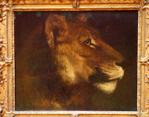
Pen drawing of Theodore Gericault's Lion

The original work:

Théodore GÉRICAULT, Tête de lionne

I think I made the lion look like a tiger...... I think I should have been more careful when drawing and shading in the details of the lion to make it look like what is it. The lines I used for shading could have been closer and neater.


Image credits:

http://www.flickr.com/photos/havala/4080454665/

Anti-Drug Art Competition 2009

Poster colour, A3

I submitted this for the Anti-Drug Art competition in 2009, it was also our EOY painting if I remember correctly.

Description of my painting I did when I submitted it:

The person at the bottom left hand corner, is squatting down, facing the corner. She is a drug addict, who is being attacked by the drugs. As she gets weaker, the drugs get stronger because she is already addicted to drugs. The drugs drive her to a corner until she feels miserable and helpless.

---

I like how the pills and syringes are painted. The syringes have that transparent effect. I thought I could have painted more pills and syringes and make it the whole streak filled with pills and syringes so that it seems like the drugs are stronger and overwhelming. I also thought the yellow streak fading away to the sides and darkening when it reaches the corner with the person gave more focus and leads the viewers eyes. But I think my blending techniques then weren't very good that's why it doesn't look smooth and well-blended.

Sunday, September 25, 2011

Ceramics

Ceramics (2009)

It was our first try at ceramics and Mr Lim wanted us to experiment with textures! I remember creating textures with many different random things around the art room. We made 5 square pieces of clay then stuck them together using slip. Then we started to make different textures/designs around the box. I wanted to keep it simple and focus on creating textures so I didn't add on any other pieces of clay on it. I enjoyed the process a lot because it was very hands-on as compared to other works we did. We used our hands and had to creating textures with different tools. We also had to use our hands to control, press, pinch, and stick the pieces of clay together to form a box. Also, I liked the fact that we tried out a different medium instead of doing pencil drawings. It was a very experimental process because we did not have to work within a theme but just do whatever we want on the box.

Nature

Tree bark, pencil, 2010

Butterfly, pencil, 2010

Bougainvillea, pencil, 2010

Small flowers, pencil, 2010

Small flowers, pencil, 2010

Sunflower, pencil, 2010

Orchid, pencil, 2010

Pollen/stigma, pencil, 2010

Dried leaf, pencil, 2010

Water droplet, pencil, 2010

Cat Whiskers, pencil, 2010

I did these drawings as inspiration for our ceramics module. I like the dried leaf one the most, because it looks the most realistic out of all the pencil drawings I did. There was close observation in my works as I had many small details drawn. However, I thought the tones that I used were rather limited so it looked rather similar and boring. I could have maximised the tonal range and made it look more realistic! I also thought I had good proportions in these drawings :-)

This is my final ceramics work:

As you can see, I've used the shapes/patterns of the leaves/flowers I drew on the surface of the pot.

I've also made textures similar to the leaves/barks on the pot! I also oxidised the leaf parts because it's green, so it'll look like the leaves. I like how one of the long leaf pops out!

A random wooden stick I made :s

Random wooden stick in the pot. The inner surface is smooth and the whole pot is glazed.

I think through this work, I was able to explore more on different textures, and I was more experienced because we had done a ceramics work before. You can see my first ceramics work here. I am happy with how my work turned out to be, and it didnt really crack in the kiln! I also like how I combined all the textures and patterns onto the pot, making it look interesting. I realised my works are always pretty simple with a few important elements in it.

Black & white

We had to do pin-hole photography for our AEP SIA in Sec 2, and these are my shots!

This was my final photograph I decided to submit:

Write-up for this photograph:

This photograph of the school clock tower is taken from the view of the field. We usually have out PE lessons there and we run around the track to warm-up or have our 2.4km run. For those who hate PE lessons, they would look at the clock tower once in awhile to check the time as they can't wait for the lessons to be over.

I think I could have made the image a little clearer and sharper if I had not shook the pin-hole camera. Not only that, I could have been more careful when cutting the papers, to prevent less fingerprints. I could have aimed and place the camera at a stable place, or stick them with tape.

Through this activity, I've learnt how to be patient. It was tiring to stay in the darkroom and wait for chemicals to react.

Reflections:

I enjoyed doing pinhole photography and have learnt the simplest version of taking a photo. It was tiring walking in and out of the dark room, capturing images of our school with out tin can. I even tried to take an image of the school from the overhead bridge, but it was not successful. If I had the chance, I would definitely try it again. It was interesting to look out for special scenes around the school and try to create a unique perspective. Although taking just a photo and developing it would take such a long time, it was definitely worth it. I liked the moment when I see an image slowly appearing on the photographic paper in the developing chemical.

---

After the pin-hole activity, Mr Lim let us use his film camera to take some photos. We only had black & white film!

After going through this 2 activities, I realised it was pretty difficult to do black and white photography. Before that, I was not exposed to b&w photography. I thought the challenging part about b&w photography is that, it is not easy to capture the essence of the subject matter without colours because what we see with our eyes are colours. So it would take a lot of skill and experience to take a good b&w photograph that can show viewers what the photographer is trying to tell! Also, I feel that b&w photography makes things a little more dull and vintage..... and reminds me of times when there were only b&w televisions.

Sec 3 Lifeskills Camp T-shirt Design 2010

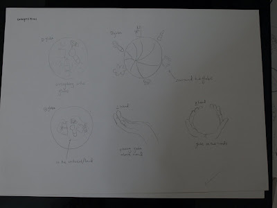
My initial ideas, mindmap, research drawings of hand, elements in the design (in pen and pencil)

Compositions:

Arrangement of elements in globe:


Alternative designs:

My final design:

I really liked how my final design turned out to be. This was one of the works that made me realise it was important to do prep work before final because I did my prep drawings diligently! I like how the entire drawing in pen has different thickness and the lines are of different boldness. But I thought I could have done more research drawings to develop my idea and give myself more options to choose from.
Tones

pencil, A4

(February 2010)

Drawing of strips of paper stuck on a board, with light shining on it. Personally, I think that I cropped off too much of the paper strips, making it look really disconnected from the other paper strips. This made the work look "too little" and incomplete. I shouldn't have cropped off so much and filled up the paper more to make it look more complete and better.

pencil, A4

(February 2010)

Drawing of cloth showing draperies. I think I did well in blending the tones and it is much better as compared to the drawing of the strips of paper! However, I shouldn't have "zoomed in" so much because it made my composition look very simplified, and it is hard to tell that it is draperies. I should have "zoomed out" a little and include more draperies into this drawing to make it recognisable.

Flower, oil on canvas, B5

(March 2010)

It was my first time using oil painting so I had some slight difficulties in controlling the tones of the black, white and grey. I think it takes a little practice to be able to paint and create smooth and well-blended tones. I thought I did pretty well in blending the tones and making it look like smooth flower petals. However, I thought I could have added more whites in the painting to make it look more realistic and widen the tonality range.

Don't Forget

Don't Forget, water colour and illustrator (2011)

My coursework final, Don't Forget. It is a calendar that I made, featuring 6 important people in my life. The 2012 calendar acts as a reminder for me to spend time with these important people in my life, so as to maintain and keep our relationships close. I marked down their birthdays in the calendar as people normally gather together for birthday celebrations.