Monday, September 26, 2011

comments

at Valerie's:

http://eevcee.blogspot.com/2011/08/this-is-20109-design-done-this-year.html?showComment=1316881145911#c5206307614561870392

http://eevcee.blogspot.com/2011/04/photography-on-food-d-my-favourite-hope.html?showComment=1316884886492#c9152036666851832393

at Shiyin's:

http://sylaep.blogspot.com/2011/06/what-is-this.html?showComment=1317029705559#c8035638800297262188

at Clare's:

http://pppepperoni.blogspot.com/search/label/coursework

at Heyao's:

http://i-have-sung-it-over-the-way.blogspot.com/2011/09/art-work-after-dark.html?showComment=1317046469280#c3968487697396845185

at Lois':

http://four-memories.blogspot.com/2011/09/heart.html?showComment=1317047029768#c3286127153614371085

Chua Mia Tee and Bayu Utomo Radjikin

Workers in the Canteen by Chua Mia Tee 1974

Oil on canvas, 89 x 126cm


Lang Kacang by Bayu Utomo Radjikin 1991

Mixed media, 141 x 104 x 120cm

---

How did the artists address the above social concerns/issues through their work?

Chua Mia Tee has addressed his idea through a realistic and straightforward style. He believes that art must reflect real life and that viewers of his work and art must be able to understand what the artist is trying to express and his ideas. He has painted in the style of realism so that people are able to understand his intentions and ideas easily.

He has chosen a clear subject matter which can be easily related by local Singaporeans, thus being able to understand the issue. Also, he has made use of the exaggerated lighting, which focuses on the first bench of workers eating. He has also made use of lines, thought the arrangement of the benches and tables. These lines bring viewers' eyes slowly through the painting from the foreground to the background. The use of light and lines are done so to put focus on the workers eating.

Chua Mia Tee often uses photographic aid, so that he can arrange his subject matter and compositions. He makes use of such composition, which enhances and improves his expression of his concern and idea of work.

Bayu Utomo, on the other hand, has made use of the different materials to express his idea of urbanisation destroying traditional cultures. He has chosen to use metal chains that are chained to the sculpture, to represent the pull of the advancing technological development, and that these traditional tribes are unable to run away from the fact that urbanisation is able to erode their cultures. The feathers and the distorted expression represent the struggles of these tribal communities. The contorted leg of the sculpture also shows that it is rooted to the ground and unable to run away from the clutches of urbanisation, which are represented by the metal chains chained to the sculpture. The sculpture makes the viewers feel the pull of urbanisation and that tribal communities are changing and suffering. He made use of a more symbolic style of expressing his concern.

Beginner

These are the works I did in Sec 1:

Pencil, A3, 9th January 2008

I thought I had good proportions and shading for the bottle for this piece, even though it was incomplete. I showed the reflections on the bottle and sectioned the parts to shade. Also, I lightened the lines where the bottles are further away, to show a sense of depth. But I think I had a limited range in tones and the tones looked similar throughout.

Pencil, A3, 14th February 2008

I think the drawing of my hand was a little out of proportion, too slanted. It was a difficult pose. I showed distinct tones but it wasn't well-blended and smoothened out, so the texture doesn't look like skin.

Water colour, A3, 4th April 2008

For this painting, I had good proportions but I think I should have added more tones.

Pencil, A3, 24th April 2008

I think I chose a good composition to draw but I could have added another mushroom to create a sense of depth in this drawing. I think I was sensitive in the tones for this drawing. I left many pencil marks on drawing and I think I shouldn't have drawn so hard onto the paper. When I erase it, it left really ugly marks. Could have been more careful!

Wood-cut and print-making self-portrait

We had an wood-cut/linocut and print-making assignment. I chose wood-cut then because I thought wood was harder to carve and I wanted to give it a try! We had to draw our self-portraits first and then transfer it onto a tracing paper. Then we drew on our wooden boards. We had to carve our portrait in a 'inverse' manner, like for example if we want a part of the portrait to be printed, we don't carve those parts. At first, everyone was complaining about how confusing it was but I guess we soon got used to it!

I think my final print looks like me! I also kept the background simple because I thought the my face and hongzi looked complicated enough and I wanted to have a balance between the blacks and whites in the print. I thought it was an interesting experience because it was our first time doing this and I've always loved trying out different mediums and types of art. It was also really hard to carve the wood. I got a couple of cuts on my fingers because I wasn't careful. It was pretty hard to control because wood is hard so I had to do it slowly. All in all, I thought it was a fun experience and I don't mind doing it again!

Drawings

Here are some drawings/paintings I did during the AEP London/Paris Trip last year(2010).

Flower, pen, 22cm x 6cm

Flower 2, pen, 11cm x 4 cm

Drew the 2 flowers outside Tate Britain

Leaves, water colour, 17cm x 5cm

Flower, water colour, 7.5cm x 7.5cm
Did the 2 paintings above at Monet's Garden. Wish we had more time there though! I remember it was pretty cold that day. But it was amazing to be there when all the flowers were blooming so beautifully. I guess that was what made Monet's works so beautiful :-) It was amazing to be able to look at his garden, where he did many of his works! I think one's environment really affects what an artist do and create.

Pen drawing of Theodore Gericault's Lion

The original work:

Théodore GÉRICAULT, Tête de lionne

I think I made the lion look like a tiger...... I think I should have been more careful when drawing and shading in the details of the lion to make it look like what is it. The lines I used for shading could have been closer and neater.


Image credits:

http://www.flickr.com/photos/havala/4080454665/

Lucia Hartini

What social conerns are intended in Lucia Hartini's work? Discuss with reference to "Spying Eyes" and another named work by Lucia Hartini.

Lucia Hartini's works represents the struggles and fears of the Indonesian society that she lives in. The traditional culture in Indonesia views women as the weaker gender and are only able to be homemakers, housewives who take care of children, cook and do housework at home. There are also very few female artists in the Indonesian society as compared to male artists.
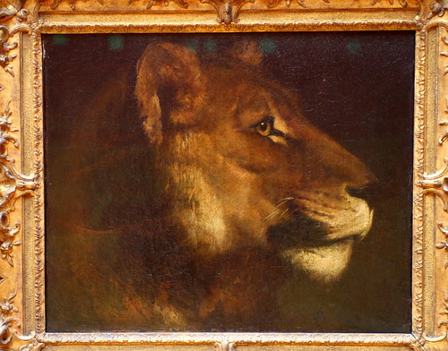
She has expressed her struggles through her works like Spying Eyes and Sri Kandi. Spying Eye depicts the society's traditional view on women, as represented by the eyes around the brick walls, staring at the female figure. The female figure could represent Lucia Hartini, whereby she is in a foetal position, floating above the ground. This shows that Hartini feels very vulnerable, weak and passive about the society's inequality and unfair, unequal views on the different genders. She feels constrained by such a view as a female artist in Indonesia. She has an obssession with eyes and is frightened by eyes as the eyes represent views of others in the society. She feels that someone is always watching her and judging what she does and thus, she painted the eyes to show how others are staring at her, judging her. The cracked brick walls also represent her struggles in the society as she did not like people viewing her in the traditional way and to judge her. She is trying to overcome this obstacle and be brave to overcome what others view women in society and her.
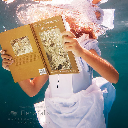
Sri Kandi is also a sequel to Spying Eyes as in Sri Kandi, she painted her emotions and her confidence and determination to confront all judgments of others. "Sri Kandi" is a Javanese traditional puppet that represents a Mahabrata epic, warrior women in the past. Hartini depicts herself as "Sri Kandi" to show that she is bold and brave, and has changed from someone who is powerless, vulnerable to someone who can overcome her struggles and problems. Sri Kandi represents Lucia Hartini. Also, the female figure which represents Hartini in the painting is wearing blue cloth. Blue cloth represents that she is strong as the female warriors in the past wore blue. Her body language in Sri Kandi also represents how strong-willed she has become and that she is determined to overcome others' judgments. The blue drapery from her dress also extends out and is lying on the brick walls, showing a sense of stability that Hartini feels towards her struggles in the past. She no longer feels constrained by the society's traditional judgments. The zig-zagged brick walls in the painting also extended out into the background of the painting, straightening out. The zig-zagged walls extended out as a straight brick wall, and might represent how she feels that things have straightened out and she is brave, no longer worried about others' judgments.

Lucia Hartini has explored dreams and imagination as she sought to discover herself through her works. Why did she create dream-like imagery and do you think she has been effective in using dreams as part of her works? Discuss with reference to her named works.

Lucia Hartini created dream-like imageries to express and carry her personal and social messages as Indonesia had a traditional culture that found straightforward critical and confessional discourse unacceptable. Therefore, Hartini could not paint realistic scenes of the society and could only express her struggles in the society through dream-like imageries and by using allegorical or symbol-laden styles. This is so as to not subject to further criticism.
For example, in Nuclear Explosion in a Wok III, Hartini expressed her anger with the society through the nuclear explosion, which is also in tones of reds and orange. She has been effective in her works as she is able to carry her messages and ideas through art in a restrained manner as she could not be very direct in the society.
She also created dream-like imageries to express her ideas indirectly. Her dream-like imageries, which are placing subject matters with no relations, and has a setting that is not seen in real-life context but can only be imagined or appear in dreams and fantasies. She also painted in highly academic, accurate brushstrokes, producing realistic forms of humans, cosmo and scenes.
In Sri Kandi, she made us of symbols and colours to express her feelings and emotions. The blue dress represented how she felt brave, bold and strong to overcome others' views and judgments that are traditional but unfair to the different gender, as blue was the colour that female warriors wore in the past. She also depicted herself as "Sri Kandi", a famous "women warrior" of South East Asia, representing how courageous she has become. Hartini has been effective in using dreams as part of her works as she made use of symbols to represent a meaning, emotion that she feels and her struggles in the society. She also made use of dream-like imageries by painting cosmos that has relation to nature elements as she grew up in a natural and carefree environment, and she yearns to return to that environment where no one would judge her in this current society.

Anti-Drug Art Competition 2009

Poster colour, A3

I submitted this for the Anti-Drug Art competition in 2009, it was also our EOY painting if I remember correctly.

Description of my painting I did when I submitted it:

The person at the bottom left hand corner, is squatting down, facing the corner. She is a drug addict, who is being attacked by the drugs. As she gets weaker, the drugs get stronger because she is already addicted to drugs. The drugs drive her to a corner until she feels miserable and helpless.

---

I like how the pills and syringes are painted. The syringes have that transparent effect. I thought I could have painted more pills and syringes and make it the whole streak filled with pills and syringes so that it seems like the drugs are stronger and overwhelming. I also thought the yellow streak fading away to the sides and darkening when it reaches the corner with the person gave more focus and leads the viewers eyes. But I think my blending techniques then weren't very good that's why it doesn't look smooth and well-blended.

Sunday, September 25, 2011

Ceramics

Ceramics (2009)

It was our first try at ceramics and Mr Lim wanted us to experiment with textures! I remember creating textures with many different random things around the art room. We made 5 square pieces of clay then stuck them together using slip. Then we started to make different textures/designs around the box. I wanted to keep it simple and focus on creating textures so I didn't add on any other pieces of clay on it. I enjoyed the process a lot because it was very hands-on as compared to other works we did. We used our hands and had to creating textures with different tools. We also had to use our hands to control, press, pinch, and stick the pieces of clay together to form a box. Also, I liked the fact that we tried out a different medium instead of doing pencil drawings. It was a very experimental process because we did not have to work within a theme but just do whatever we want on the box.

Nature

Tree bark, pencil, 2010

Butterfly, pencil, 2010

Bougainvillea, pencil, 2010

Small flowers, pencil, 2010

Small flowers, pencil, 2010

Sunflower, pencil, 2010

Orchid, pencil, 2010

Pollen/stigma, pencil, 2010

Dried leaf, pencil, 2010

Water droplet, pencil, 2010

Cat Whiskers, pencil, 2010

I did these drawings as inspiration for our ceramics module. I like the dried leaf one the most, because it looks the most realistic out of all the pencil drawings I did. There was close observation in my works as I had many small details drawn. However, I thought the tones that I used were rather limited so it looked rather similar and boring. I could have maximised the tonal range and made it look more realistic! I also thought I had good proportions in these drawings :-)

This is my final ceramics work:

As you can see, I've used the shapes/patterns of the leaves/flowers I drew on the surface of the pot.

I've also made textures similar to the leaves/barks on the pot! I also oxidised the leaf parts because it's green, so it'll look like the leaves. I like how one of the long leaf pops out!

A random wooden stick I made :s

Random wooden stick in the pot. The inner surface is smooth and the whole pot is glazed.

I think through this work, I was able to explore more on different textures, and I was more experienced because we had done a ceramics work before. You can see my first ceramics work here. I am happy with how my work turned out to be, and it didnt really crack in the kiln! I also like how I combined all the textures and patterns onto the pot, making it look interesting. I realised my works are always pretty simple with a few important elements in it.

Black & white

We had to do pin-hole photography for our AEP SIA in Sec 2, and these are my shots!

This was my final photograph I decided to submit:

Write-up for this photograph:

This photograph of the school clock tower is taken from the view of the field. We usually have out PE lessons there and we run around the track to warm-up or have our 2.4km run. For those who hate PE lessons, they would look at the clock tower once in awhile to check the time as they can't wait for the lessons to be over.

I think I could have made the image a little clearer and sharper if I had not shook the pin-hole camera. Not only that, I could have been more careful when cutting the papers, to prevent less fingerprints. I could have aimed and place the camera at a stable place, or stick them with tape.

Through this activity, I've learnt how to be patient. It was tiring to stay in the darkroom and wait for chemicals to react.

Reflections:

I enjoyed doing pinhole photography and have learnt the simplest version of taking a photo. It was tiring walking in and out of the dark room, capturing images of our school with out tin can. I even tried to take an image of the school from the overhead bridge, but it was not successful. If I had the chance, I would definitely try it again. It was interesting to look out for special scenes around the school and try to create a unique perspective. Although taking just a photo and developing it would take such a long time, it was definitely worth it. I liked the moment when I see an image slowly appearing on the photographic paper in the developing chemical.

---

After the pin-hole activity, Mr Lim let us use his film camera to take some photos. We only had black & white film!

After going through this 2 activities, I realised it was pretty difficult to do black and white photography. Before that, I was not exposed to b&w photography. I thought the challenging part about b&w photography is that, it is not easy to capture the essence of the subject matter without colours because what we see with our eyes are colours. So it would take a lot of skill and experience to take a good b&w photograph that can show viewers what the photographer is trying to tell! Also, I feel that b&w photography makes things a little more dull and vintage..... and reminds me of times when there were only b&w televisions.

Don't Forget


6 x A4

Water colour, pen (2011)

I started off doing my coursework, following the theme of relationship between people who are important to me and treasuring time with friends/family, because I feel that people around me play a big role in my life and I wanted to do something important to me for my coursework. I have chosen to present my final work in a calendar format, featuring 6 important people in my life. They are my father, Shiyin, Chermaine, Enning, Lynn and Weiping. I chose to present it in a 2012 calendar as I wanted use it to act as a reminder for myself to spend time and maintain our relationships as relationships need time to foster and are based on what we do together, or how we spend time together. Also, I've always liked making art that is practical and usable in our lives, because I think that makes the art-making process more meaningful.

After that, I moved on to taking photographs of scenes where my friend/father and me are together, spending time and doing something together. I wanted to place these scenes into the calendar as I feel that to maintain relationships with other people, we have to spend time together and at the same time do something together to improve our relationship.

And then I proceeded to drawing these scenes out in pencil, pen and water colour. I chose water colour and my main medium and used pen to enhance the lines of the subject matter in the painting. The reason why I chose water colour was because I thought water colour is smoother, natural and less harsh as compared to other mediums like oil paint, acrylic and colour pencil. I thought the colours of water colour painting would be able to bring out the idea of the scene more. Also, I wanted to explore water colour painting because I was inspired by Dallas Clayton. I saw his works here and seeing his works made me want to try out water colour. Also, Dawn Tan! I found her blog a year ago and have always read her blog since then. I've always liked how she used water colour for her food paintings. You can see my post about her here.

After which, I did around 3/4 compositions for each scene/page of the calendar and started on my final. I painted all the scenes on A4 water colour paper and scanned them in to put it into my calendar template! I had 2 layouts, for the portrait and landscape paintings, you can see them here. I also added in birthdates of these people into the calendar, because we most often spend time with a person during his/her birthday celebrations and I think that birthday celebrations always bring people together. Also, birthdates are more personal and representative of a person.

Throughout the entire coursework process, I was rather slow and I thought I did too little research drawings. I could have drawn more and explored more into the scenes and elements of each painting. But seeing the final work I've came up with, it feels very rewarding and I'm proud of my work because I know I did put in hard work and tried my best to make it my best and final work in Nanyang AEP! There were definitely times when I feel annoyed with my works but at the end, I still try my best because I loved art and loved what I was doing.

Also, I've definitely improved my water colour painting & pen drawing skills! I still like these 2 mediums because I'm able to control them well :-) I think being able to paint is amazing and it is also rather therapeutic? Whenever I paint a particular scene, it makes me think more about the person, and my relationship with him/her. This work is pretty personal because I felt a lot for it when I painted the paintings. Another thing I've gained/learnt through this coursework is the importance of friendship! I am so thankful for my friends, Val, Cher, Sy, Clare, who've helped me through the coursework process, gave me opinions, ideas and motivated me to continue my work. They also helped me a lot with my 8 prep boards on the submission day!!! I was so stressed/nervous/tired I couldn't really think properly then (thanks to Linhui too!)

Elena Kalis

Looking glass 7High Tea
Alice's Book
Alice's Somersault
Elena Kalis' series of underwater photographs, Alice in Waterland.

I've looked through Elena Kalis' photographs and I found this series extremely beautiful and dreamy. Taking photographs underwater makes her subject matter look softer, and it has a little floating effect. I think it is not easy to take photographs underwater because there are many things you cannot control underwater, like hair, clothes, and you would have to direct the model in what action to do and capture the right moment quickly before the model floats up. But I think that something beautiful that can be achieved through underwater photography are reflections and air bubbles in the water. These reflections and air bubbles adds effect to her photographs.
I have never really seen underwater photography like what Elena Kalis does, and I find it inspiring because it's a very unique style. Also, I like how Elena Kalis works with the environment, which is water in this case, and make her photographs beautiful by capturing the reflections and air bubbles underwater.
It made me interested in doing underwater photography but...... I do not have underwater photography equipments, waterproof cameras, so I guess I could try underwater photography out by using waterproof disposable film camera!

Photo credits:
http://www.flickr.com/photos/sugarock/

Sec 3 Lifeskills Camp T-shirt Design 2010

My initial ideas, mindmap, research drawings of hand, elements in the design (in pen and pencil)

Compositions:

Arrangement of elements in globe:


Alternative designs:

My final design:

I really liked how my final design turned out to be. This was one of the works that made me realise it was important to do prep work before final because I did my prep drawings diligently! I like how the entire drawing in pen has different thickness and the lines are of different boldness. But I thought I could have done more research drawings to develop my idea and give myself more options to choose from.