Sunday, September 25, 2011

Tones

pencil, A4

(February 2010)

Drawing of strips of paper stuck on a board, with light shining on it. Personally, I think that I cropped off too much of the paper strips, making it look really disconnected from the other paper strips. This made the work look "too little" and incomplete. I shouldn't have cropped off so much and filled up the paper more to make it look more complete and better.

pencil, A4

(February 2010)

Drawing of cloth showing draperies. I think I did well in blending the tones and it is much better as compared to the drawing of the strips of paper! However, I shouldn't have "zoomed in" so much because it made my composition look very simplified, and it is hard to tell that it is draperies. I should have "zoomed out" a little and include more draperies into this drawing to make it recognisable.

Flower, oil on canvas, B5

(March 2010)

It was my first time using oil painting so I had some slight difficulties in controlling the tones of the black, white and grey. I think it takes a little practice to be able to paint and create smooth and well-blended tones. I thought I did pretty well in blending the tones and making it look like smooth flower petals. However, I thought I could have added more whites in the painting to make it look more realistic and widen the tonality range.

Antoinette-Fleur


I am completely blown away by her works! It feels like Antoinette-Fleur is drawing a controlled piece of mess isn't it? I like how she makes use of so many colours and yet keep her subject matter recognisable! Her use of lines is simply impressive! It's like 乱中有 序 . I also like the fact that she uses one of the most basic marker pens from stabilo that we can find at any stationery store. In her mess of lines, it defines her subject matter clearly and I love how unique her style is. I have never seen anyone who can do something like that! She is also able to create different tones by overlapping different colours.

Not only does she do colourful illustrations, she does it in black and white too!


Even in black and white drawings, she is able to use lines to define the shapes and forms of a human being. I find it especially hard for me to do works like that because I like to be in much control of what I draw - defined and controlled lines. But Antoinette-Fleur's works seem like they are not fully controlled but yet she defines the forms, which I find amazing and challenging. It sort of inspires and challenges me to try drawing in this style next time because I have an interest in pen/marker drawings!

Image credits:

http://www.antoinettefleur.fr/

Don't Forget

Don't Forget, water colour and illustrator (2011)

My coursework final, Don't Forget. It is a calendar that I made, featuring 6 important people in my life. The 2012 calendar acts as a reminder for me to spend time with these important people in my life, so as to maintain and keep our relationships close. I marked down their birthdays in the calendar as people normally gather together for birthday celebrations.

Coursework 8 boards

Little things

Some digital photographs I took in Paris:

flowers

the sky between two different buildings

Once again, my obsession with skies! Two sky photographs below as well!


I kind of like it when things are symmetrical, which explains the photograph above. Taken at Monet's garden. I don't like to crop or edit my photographs so I usually try to take the 'perfect' and right photograph on my camera, then I would not have to edit them when I get home. I like how it's dark and it gets brighter at the end of the walkway.

Isn't this butterfly beautiful? And it's on the tiny little flowers! I like to take photos of insects too because I think they always have unique features/patterns on their bodies, so it's interesting to look at them.

Everyone walking towards the direction of the little house, and also, the beautiful sky and clouds.

I feel that one of the important things about photography is to capture little things around our lives, it might not necessarily be something massive, it can be just something simple we see in our lives. I think these are the little things that makes our life beautiful and worth capturing down.

Horsey / Write a Bike

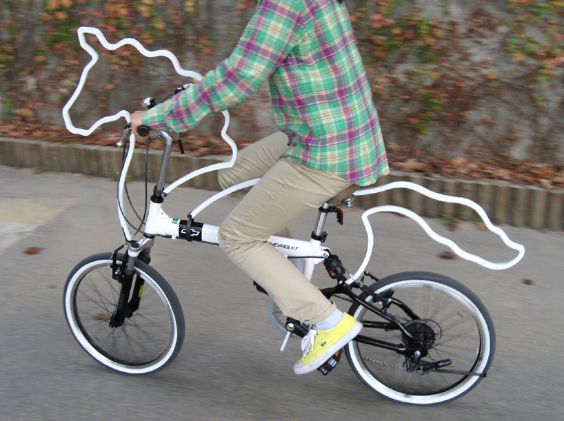
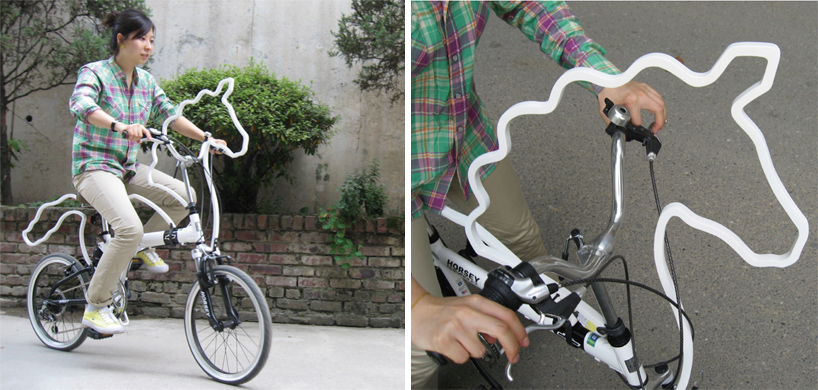
Horsey by Eungi Kim

Designer's own words:
'horsey' is an attachable bicycle ornament/accessory which makes one's bicycle look horsey!
the 'horsey' package includes wooden ornaments (horsey shape body), metal parts, and screws.
the manual is very simple so that anyone can easily arrange it according to one’s needs.
through this 'horsey' project. I wanted to give a special look to bicycles so that people would care
about cycling not only as transportation but also as a lovely pet.


I think the designer has a really interesting concept of combining a pet and one's bike together, so that we can treat our bikes like our pet! It also looks very cute. When you ride on it, it will seem like you're riding your pet horse instead of a usual boring looking bike.

I also saw other bike designs from part of a project called "Write a Bike", created by an art director, Juri Zaech who lives in Paris.


You can see the other designs here.

All these are just prototypes only. But I hope to see it made into real bikes, and see people riding it around the world. I think it's interesting how both the designers design interesting bike designs to fit the person more, making it more personal. Usually when we see bikes, people would spray paint it into other colours or stick stickers to make it more personal, but I think that their bikes don't really stand out to show their personalities. I think the bikes that these designers came up with are really unique and interesting ideas to suit people who want something special and different from others. I think design is all about being unique because who would want to come up with a design similar to others'? I like to think that whenever I'm doing a design, it has to be brand new and a fresh idea for everyone to see!


Photo credits:

http://www.designboom.com/weblog/cat/8/view/11472/horsey-by-eungi-kim-seoul-cycle-design-competition-shortlist-revealed.html

http://www.behance.net/gallery/Write-a-Bike/716663

An Awesome Book


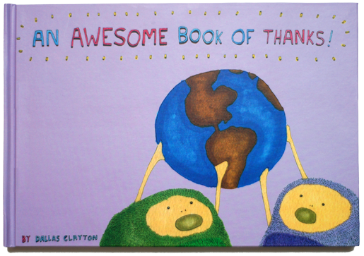
Dallas Clayton writes children books and I think he has amazing illustrations and drawings in his books!

What I really like about his works is that his works for children are so colourful, fun and inspiring! I think it's great to use art to influence and inspire others, especially children. He initially wrote this book for his son to tell him to never give up, but he didn't know that there were so many people around the world reading that book of his online. Many people wrote to him telling him that he had inspired them and many of them were reading that book to their children. I think it is very rewarding as an artist to know that many people appreciate your works! In return, he wrote another book "An Awesome Book of Thanks!"

You can read his book here!

He uses water colour and pen, which are my favourite mediums and that's one of the reasons why I picked water colour and pen for my coursework! I think it's simple and less messy as compared to oil painting. And I feel that the colours are so beautiful and the pen outlines can enhance the subject matter.

He created his art for his son, but ended up influencing and inspiring many others around the whole wide world, isn't it amazing? :-) I hope that maybe one day I'll be able to do something like that as well, because that is what I feel art is about, influencing and inspiring others to do even better in their life, or just to make them simply smile and cheer up their day!

Photo credits:

http://dallasclayton.com/